

Driving Digital Performance for a Digital Media Brand
Headless CMS scales and improves WPWhiteBoard’s content distribution, flexibility, and personalization
You know the feeling. The pitch went perfectly. The client fell in love with the high-fidelity mockups—those sweeping, cinematic headers and delicate typography that promised a truly "premium" feel. But then, the first staging link arrives.
On your laptop, it looks okay. On the CEO’s phone, the headline is cut in half. On a tablet, the hero video freezes, blocking the CTA. The magic evaporates, replaced by the crushing reality of the browser window.
Here is the truth: Your brand's ambition must match readiness; specifically, technical readiness. You cannot build "wow" moments on shaky, static foundations. You need a system that breathes.
Immersive brand experiences rely on adaptive systems that prioritize continuous user flow over static, "above the fold" layouts. By governing content through user intent rather than fixed pixel coordinates, agencies create high-fidelity environments that scale seamlessly across devices without sacrificing performance. This shift from rigid design to adaptive behavior is the definitive method for maintaining brand integrity while reducing user anxiety.
Forget the fold. It’s time to build for the flow.
We need to have a hard conversation about control. In the print world, you controlled everything: the paper weight, the ink density, the exact margins. But on the web, clinging to that level of static control is a liability.
When you design for a fixed canvas, you aren't preserving the brand; you are creating a fragile environment where the brand promise shatters the moment a user rotates their screen.
Static layouts are actively sabotaging your "wow" moments. Here is why.
You have a PDF brand book that is beautiful and rigid. The natural instinct is to apply that same rigidity to the web design to prevent dilution.
The friction arises when that rigid vision meets the chaos of real-world rendering. You worry about above-the-fold placement because it’s the only place you feel you can guarantee visibility.
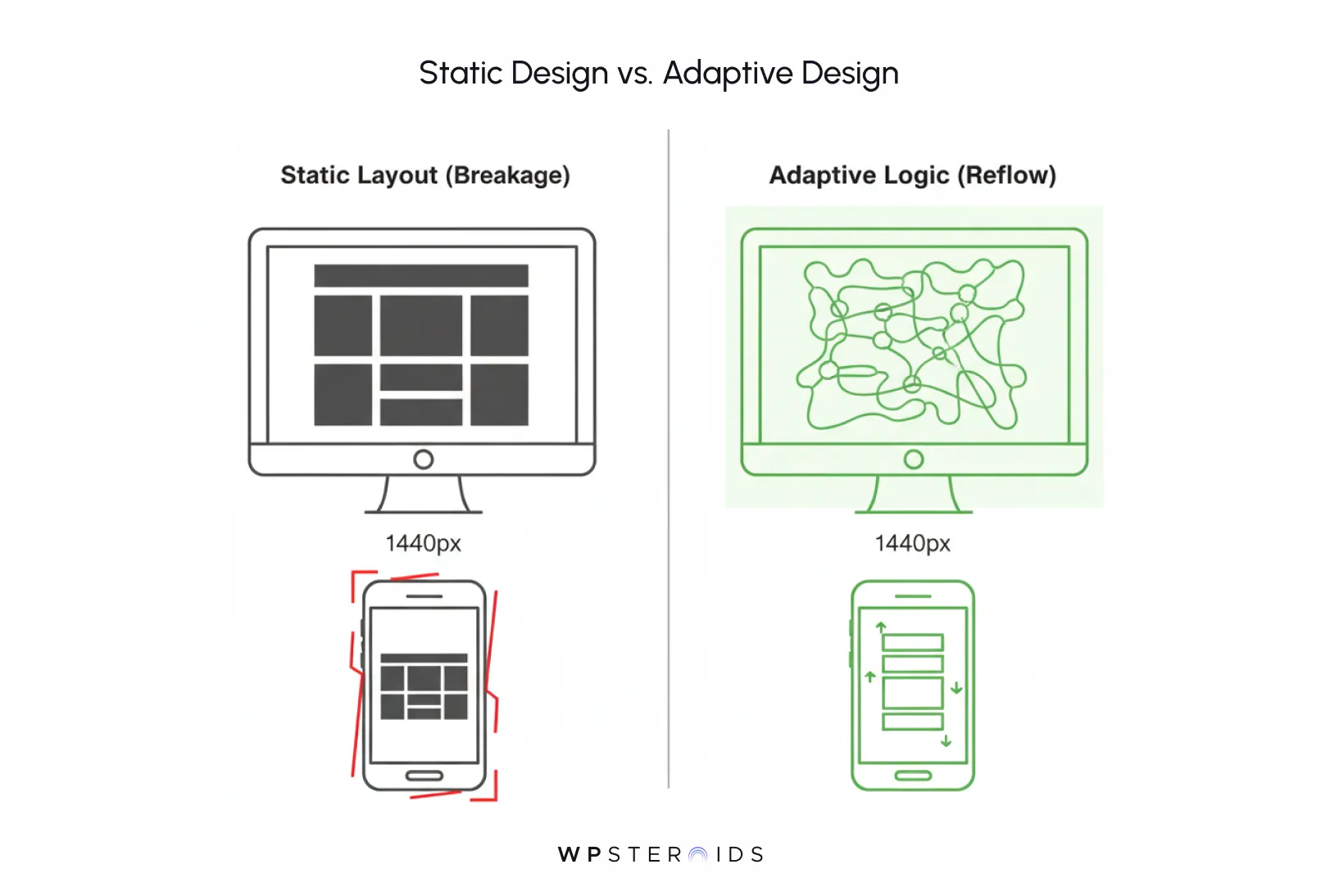
But this fear drives a dangerous wedge between your creative team and your developers. The creatives design a "perfect" 1440px desktop view, and the developers are left to hack it apart for the other 99% of screen sizes.
The result isn't purity; it's breakage. By refusing to let the adaptive brand breathe, you create an experience that feels broken for everyone who isn't viewing it on a specific monitor in a design studio.
For years, the industry has argued about the fold. "Is the fold dead?" "Do people scroll?"
Let’s apply a fresh perspective here. The binary debate of "fold vs. no fold" is the wrong question. The right question is: "How do we reassure users they haven’t missed the one thing they came for?"
This is where psychology beats legacy design rules. Users don't stop scrolling because they are lazy; they stop because of anxiety. They fear missed-information risk. When you jam all your content above the fold in a static, cluttered pile to ensure it's "seen," you trigger cognitive overload.
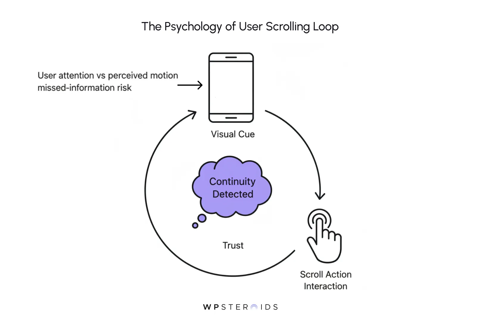
Conversely, if you have a massive, static hero image that fills the screen with no visual cue that more exists below, users assume the experience is over.
You need to eliminate anything that distracts from the flow. If you worried users wouldn't scroll, look at the data: users naturally scroll, provided they feel safe doing so. Static layouts fail to provide that safety.
They drop the user attention position abruptly. An adaptive, immersive layout acts differently; it signals continuity. It uses motion to say, "I know you are here, and there is something valuable just next door."
For boutique or luxury clients, the website is often the primary flagship store. It is the critical touchpoint from content to commerce.
When a potential customer encounters a layout that looks frozen or broken, where text overlaps images or navigation gets lost above an arbitrary line, they don't blame the browser. They blame the brand.
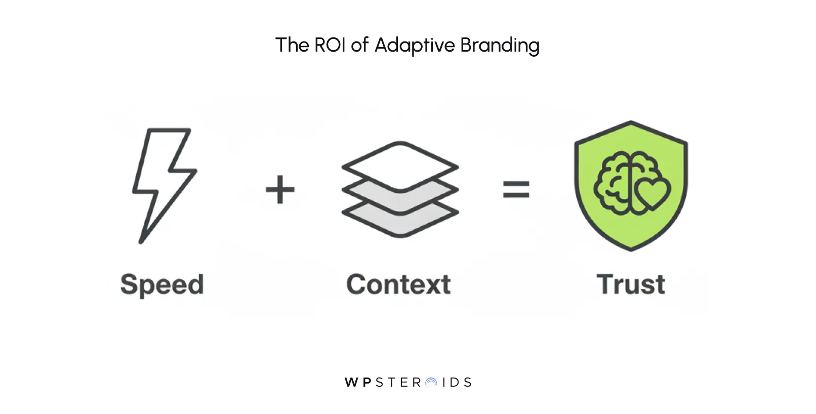
A broken or rigid experience signals that the company doesn't care about details. In the "context economy," where attention is scarce, the opportunity to deliver a competitive edge lies in smoothness.
If a competitor’s site feels like a fluid conversation and yours feels like a broken PDF, you lose the sale before the user even reads your value prop.
Moving to adaptive branding isn't just an aesthetic choice; it is a competitive advantage for your brand. It proves you are sophisticated enough to handle the user's context with care.
For too long, "immersive" has been agency shorthand for "expensive and slow." It usually meant forcing the user to sit through a preloader while a WebGL library initialized, or downloading a 50MB video just to see a logo.
But that definition is dead. Today, an immersive brand experience isn't about hijacking the browser; it’s about harmonizing with it.
For an agency, this shifts the deliverable from a static Photoshop file to a living design system. It means selling a relationship with the user, not just a layout.
If we strip away the marketing fluff, what actually constitutes an immersive experience in the code? It starts with how you handle the first impression.
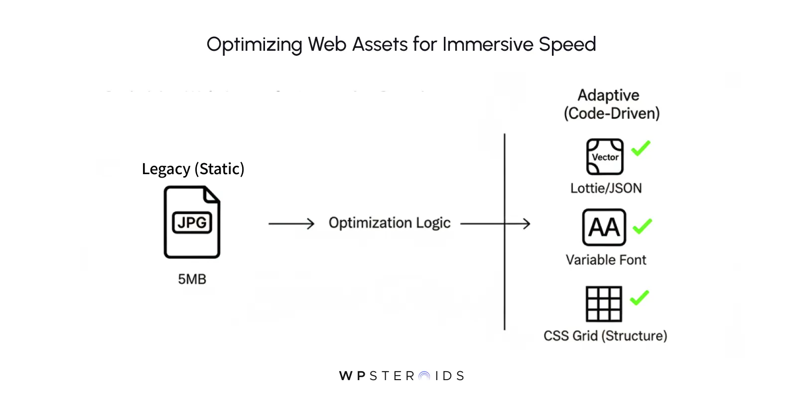
Traditionally, you might have relied on massive hero images or a heavy header image to do the heavy lifting. You’d optimize your above-the-fold content by compressing that JPEG to within an inch of its life and praying the user had 5G.
Adaptive immersion works differently. It uses visual cues, subtle animations, directional typography, or layered parallax to imply depth immediately. Crucially, you must answer the technical question: "What assets exist for reuse and what must be created to avoid bloated payloads?"
Instead of a single, heavy raster image, an immersive setup might use:
This approach creates the "wow" without the wait. It respects the user's data plan while delivering that premium gloss.
Not every client needs a cinematic scrollytelling experience. If you are building a utility bill portal, speed is the only metric that matters. But for lifestyle, luxury, tech, and narrative-driven brands, the game is different.
The immersive experience must create an emotional state where the user feels impressed by the beauty but safe in the navigation. The clear human centric experiences powered by adaptive tech are perfect for:
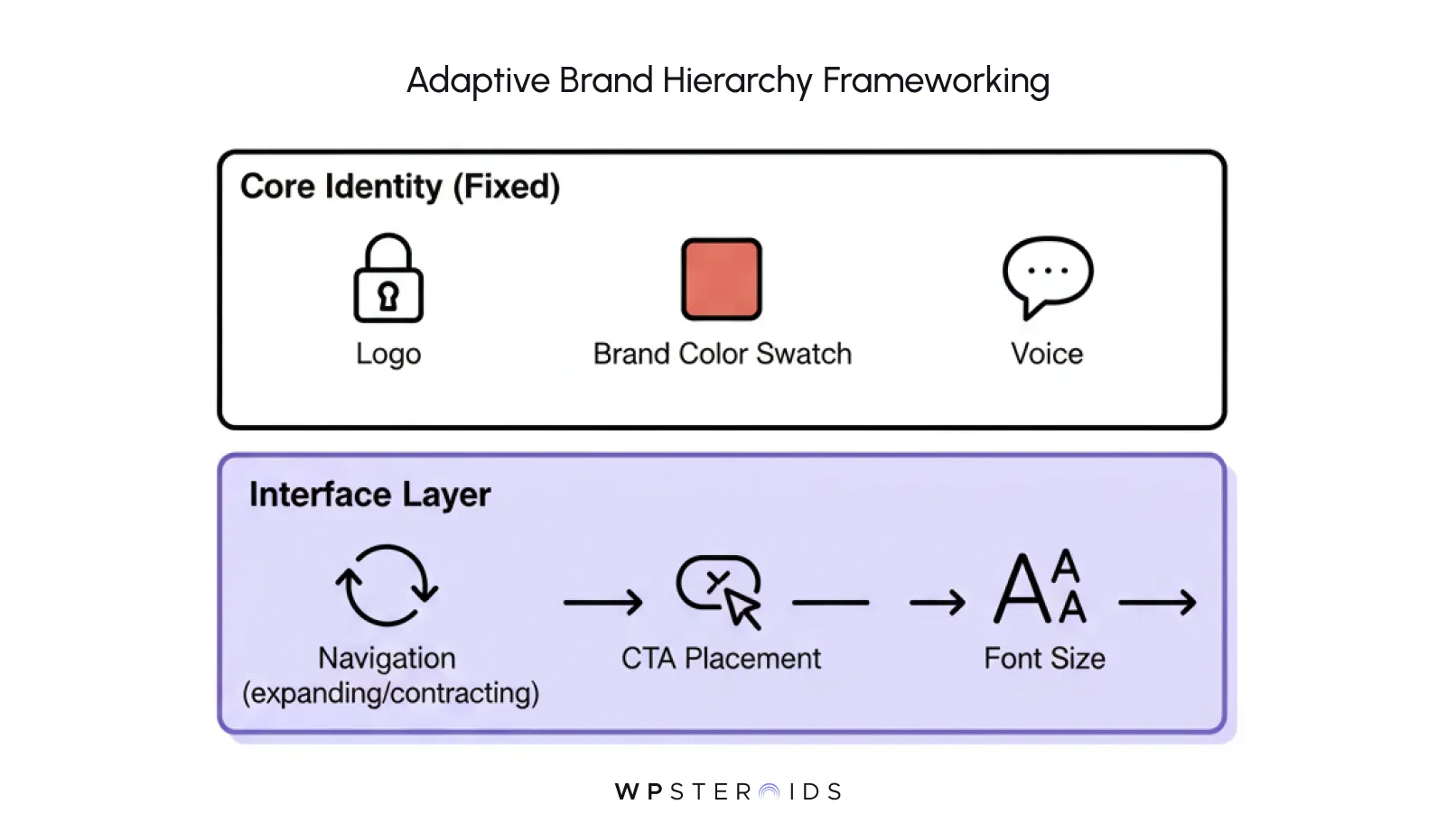
For these clients, you must identify the core brand promise that never changes.
Even if the visuals adapt, moving from a video on desktop to a high-fidelity still on mobile, the feeling of sophistication must remain absolute.
When pitching this to a skeptical stakeholder, you need to show them that this is the natural evolution of the web. The rise of responsive design gave us fluidity; adaptive branding gives us intelligence.
Paint a picture for them. Imagine a catching, thought-provoking headline and imagery that doesn't just sit there but reacts to the user’s reading speed.
These aren't just flashy tricks; they are best practices let evolve into brand assets. They show the client that you aren't just filling space, you are choreographing a relationship.
But in an adaptive system, we trade perfection for perception. We stop designing strictly for the screen and start designing for the user’s mind.
Here are the three core principles you need to adopt to start designing adaptive brand systems that actually work.
The biggest mistake agencies make is organizing content by "importance" based on a static hierarchy (Logo > Headline > CTA).
This falls apart when the screen size changes. Instead, you need to design a horizontal model that prioritizes content based on user intent.
Think of your page as a guided museum tour, not a static poster in the lobby.
A poster (the old static, above-the-fold model) screams everything at once, hoping the viewer reads the important bits before walking away. A good tour guide (adaptive branding) notices where the visitor is standing.
If they are looking at the "History" exhibit, the guide doesn't shout about the "Gift Shop." They wait. When the visitor turns toward the exit, then the guide mentions the shop.
This is context and human insight applied to code. In practice, this means asking: "Which brand elements are immutable, and which can adapt?"
You are building a horizontal model that views every interaction as a step in a journey, not a static destination.
This is where we see the industry having shifted to brand experience design rather than just web design. We use the scroll bar as a timeline.
This narrative flow reduces the anxiety of "missing out." If the interface is calm and uncluttered, the user trusts that you will show them what matters. You aren't hiding content; you are curating it.
Designing adaptive brand experiences for the modern web means acting as an editor, not just a decorator.
Your brand must feel just as expensive on an iPhone SE as it does on a 27-inch iMac. The transition just above the fold and just below the fold on a mobile device is actually more critical because the viewport is smaller. The seam between content blocks must be flawless.
If a headline is cut off on mobile, it looks like a mistake. If it’s cut off in an adaptive system, it’s a deliberate cue to scroll. The difference is "craft."
You must test the experience at the "awkward" sizes (tablets, large phones, split-screen desktop windows) to ensure the craft holds up. If the immersive feeling breaks at 800px width, the illusion is gone.
If you are a creative leader, this is the part where your eyes usually glaze over. Don't let them. This is where your vision actually survives or dies.
To build an adaptive brand experience generating real value, you need to understand the materials of the web just as an architect understands concrete and steel. We aren’t building static paintings anymore; we are building logic engines.
Here is the technical vocabulary you need to bridge the gap with your engineering team to combine intelligence, empathy building into the final product.
Think of it like a theater stage. You don't bring the props for Act 3 onto the stage during Act 1. You keep them in the wings. Technically, this means integrating your Headless CMS and CDN to serve variants in real-time.
If there is one technical term you memorize from this article, make it Intersection Observer.
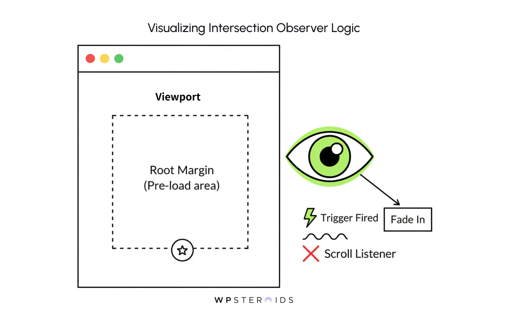
In the past, developers attached "scroll listeners" to the window. The browser had to check every single millisecond: "Did they scroll? Did they scroll? Did they scroll?" It was exhausting for the CPU and caused stuttering (jank).
This allows elements to be "aware" of being watched. When a paragraph slides into view, it triggers an animation. When a user scrolls past a section, the background color shifts.
This logic allows you to influence the user experience regardless of how fast or slow they scroll, without killing the battery life of their device. It is the engine of the "guided tour" analogy.
Nothing kills immersion faster than a choppy animation. If your beautiful transition stutters, the illusion breaks.
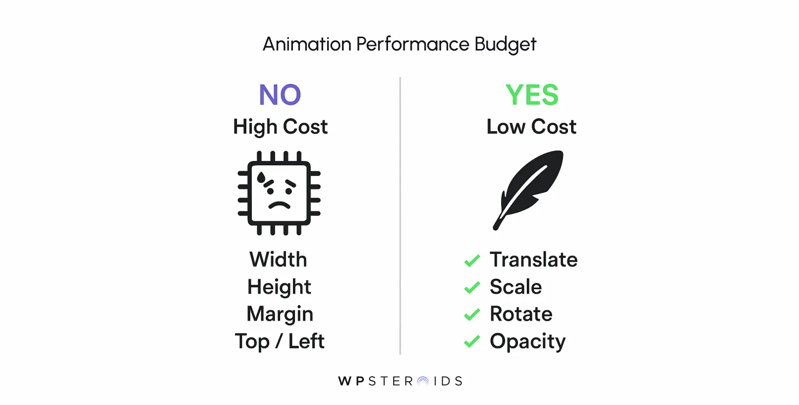
To keep animations buttery smooth (60 frames per second), your developers must strictly animate only two properties: Transform (position/scale) and Opacity.
The immersive elements at the top of the page should snap to their final state instantly rather than swooping in. This isn't a bug; it's accessibility.
When developers or marketers talk about "infinite scroll," they often forget memory management.
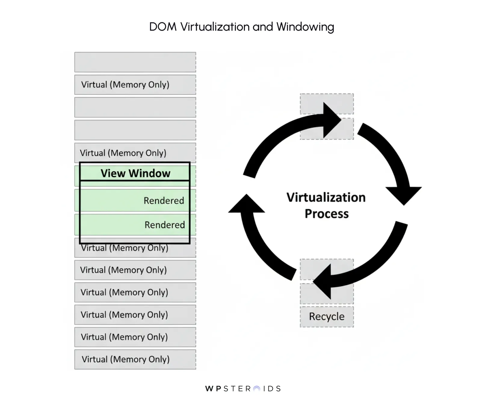
If your brand experience involves a long feed of products or stories, you cannot just keep adding photos to the bottom of the page. Eventually, the browser runs out of RAM and crashes.
The user thinks they are scrolling a mile-long page, but the browser only ever renders what is visible.
Finally, we have to talk about Google. Robots can't "experience" your brand, but they need to index it.
If your site is purely client-side JavaScript (where the screen is white until the code runs), Google might struggle to rank you. You can help optimize your above-the-fold content for search engines by using Server-Side Rendering (SSR).
SSR generates the initial HTML on the server and sends a fully formed page to the browser first. Then, the JavaScript "hydrates" the page to turn on the interactive features. This gives you the best of both worlds: the SEO visibility of a static site and the immersive interactivity of an app.
This technical nuance can help you determine whether your "wow" site actually gets found by customers. Help you determine what should be server-rendered (text, key images) versus what can wait (interactive maps, videos) to ensure the robots are happy.
The handoff. This is the exact moment where the dream typically dies. You have beautiful comps and a talented developer, but if the communication protocol is wrong, you end up with a Frankenstein product. The problem usually isn't skill; it’s translation.
To build an immersive system, you have to stop handing off "pictures" of websites. You need to hand over a set of instructions for a living machine.
Here is how you professionalize that transfer to ensure the ultimate above-the-fold strategy, which is to say, a strategy that transcends the fold entirely, actually gets built.
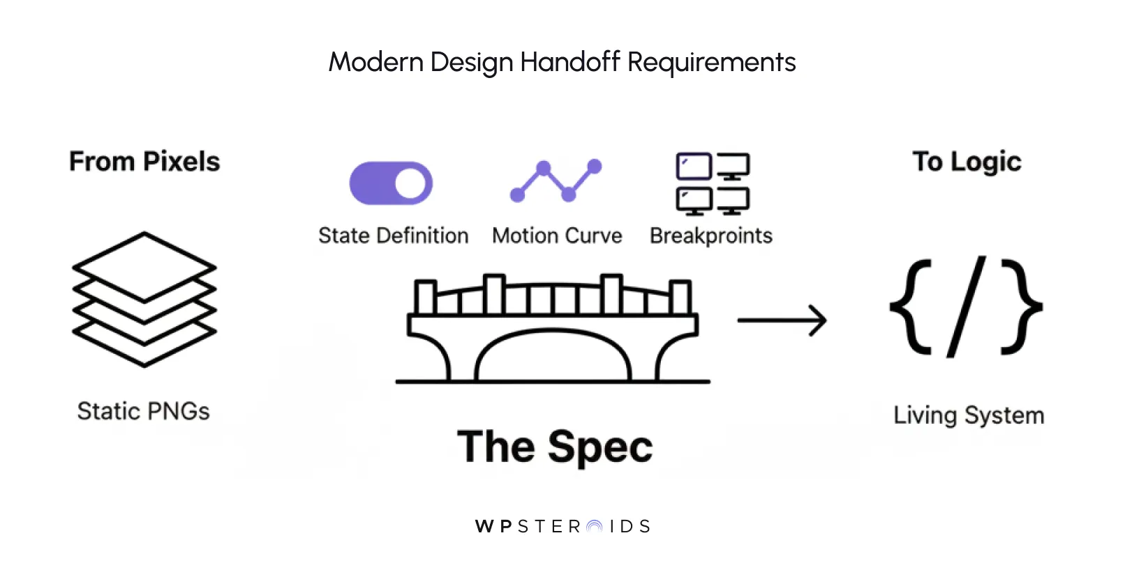
Your design deliverables must evolve from "Views" to "Behaviors."
You are giving the developer the rules of the road, not just a destination. This reduces the above-the-fold content anxiety because the developer isn't guessing where to cram things; they are following a logic map you created.
When hiring a freelance developer or briefing an internal team, the standard "Scope of Work" is often too vague. You need to lock down governance. Can help you determine what is acceptable and what isn't? A specific adaptive clause in your contract.
This checklist protects the brand. It ensures that the difference in how users treat a fast site vs. a slow one is accounted for legally and technically before a line of code is written.
Quality Assurance for adaptive branding is not about "Does it look like the mockup?" It is about "Does it feel right?"
You need to look for evidence for the fold handling errors, gaps, jumps, or flashes where the immersive experience breaks.
Signoff happens only when the site feels fluid and unbreakable, not just when it matches the pixels in Figma. You are signing off on the system's resilience, not just its appearance.
You have the vision, and you have the code. Now comes the moment of truth: the audit. An immersive brand experience that loads slowly is not an experience—it is a nuisance.
In the "Context Economy," performance is the most critical brand asset you possess. If the curtain takes too long to rise, the audience leaves before the show begins.
Here is the checklist to ensure your system performs as well as it looks.
This makes any fixed definition of the fold obsolete. The "fold" isn't a line; it is a moving target. Because the viewport is constantly shifting, your performance strategy cannot just front-load the top 800 pixels. You must adopt a "Performance Budget" for the entire journey.
When looking at quantitative studies that produce slightly varying results on engagement, the outlier is almost always accessibility. Sites that respect user preferences win on trust.
The web is a wild place. It is easy to design for the latest Chrome on a MacBook Pro, but your brand lives in the chaos of the open web.
Your adaptive system must function above an imaginary line of "modern vs. legacy" browsers.
We have built the engine (engineering) and painted the car (design). Now, we need to drive it. The actual user experience comes down to a simple psychological reality: people are anxious.
They land on your site with a high cognitive load, looking for a specific answer. If they feel lost or overwhelmed, they bounce.
Your job as an Experience Owner isn't just to display information; it is to manage that anxiety. Adaptive branding works because it replaces the "wall of text" with a conversation.
Here is how to structure your patterns and content to guide the user’s hand and mind.
The old method was brute force: shove the most critical content above the fold and hope for the best. The adaptive method uses nuance. We use visual cues to subtly signal that "the story continues."
This is about managing how users treat info above the initial view. If it looks complete, they stop. If it looks "open," they proceed.
Over a quarter, you move from high-bounce traffic to high-engagement depth. You stop training users to rush; you train them to explore.
In a static world, you design one layout. In an adaptive world, you design a system that survives any context—from a 4K monitor to a smartwatch, or even a digital display at a live event. This requires a prioritization framework that separates the "message" from the "medium."
You must ask: "How will the experience scale across live events, web, and mobile without losing fidelity?" The answer lies in decoupling the content above the fold from its visual presentation.
By using AI context and human insight, you can program the site to elevate Tier 2 content if the user arrives via a specific high-intent ad campaign, effectively remixing the priority based on why they came, not just where they are scrolling.
Here is where many agencies fail. They build a beautiful adaptive shell but leave the content static. Don't automate brand adaptation behavior just for visuals; you must automate your brand adaptation for questions, too.
The goal is to eliminate the friction between "What I want" and "What I see." When the content adapts to the user's intent, the anxiety evaporates.
Transitioning from static layouts to an adaptive, living system is a powerful move, but it is not without danger. As an Experience Owner, you are essentially trading the safety of a PDF for the volatility of software.
If you mismanage this shift, you don't just get a buggy website; you get a chaotic environment that actively repels the users you are trying to seduce.
To protect your brand, we must look the risks in the eye and plan for them.
The most common trap is "Motion Sickness." Once your creative team realizes they can make everything fly, fade, and spin based on scroll position, they often do. They stop worrying about above-the-fold placement and start obsessing over transition timing.
While Google is much better at rendering JavaScript than it used to be, it is not perfect. If your key value proposition or SEO keywords are buried in a module that only exists after a complex scroll interaction below the fold, you might be invisible to the algorithm.
This is the silent killer of projects. The "Creative vs. Dev" divide widens when you introduce complex behaviors. A designer cannot simply "mock up" a physics-based scroll interaction in a static tool. They can visualize it, but they can't feel the friction.
If the developer interprets the "spring physics" wrong, the animation feels cheap, and your brand looks amateurish.
You can have the best engineering team in the world, but if you can’t sell the vision to a non-technical CMO, it dies on the vine. The hardest part of shifting to adaptive branding isn’t the code; it’s the pitch.
Clients are comfortable with static JPEGs because they understand them. They can print them out, stick them on a wall, and sign them with a red pen.
An adaptive system is abstract. To sell it, you need to stop selling "features" and start selling "risk reduction." Here is a blueprint for structuring a pitch that proves immersive brand experiences are a safer business bet than static pages.
The mistake most agencies make is showing the solution before defining the problem. Your one-pager needs to follow a specific narrative arc that targets the client’s anxiety about dropped user attention.
Do not pitch with static slides. You cannot sell motion with stillness. However, do not bankrupt your agency by building a full production site on spec.
The "Goldilocks" solution is the Behavioral Prototype. Build a single, stripped-down HTML file. It shouldn't have final polished assets. Use grey boxes and placeholder text.
When the client plays with the prototype, they stop worrying about "losing control" of the brand and realize they are gaining control of the user's attention.
Finally, you must speak the language of ROI. When a client asks, "Why should I pay 20% more for this adaptive logic?", you answer with metrics that matter.
Don't just promise "it will look cool." Promise results based on behavioral psychology:
By framing the adaptive approach as a performance driver rather than an aesthetic luxury, you turn the "technical complexity" into a "competitive advantage."
To bridge the gap between "concept" and "code," you need concrete tools. Below are the essential building blocks for your engineering team to start building adaptive systems today.
// The Options: Define the 'Breathing Room'
// rootMargin: '-100px' means "trigger this event 100px BEFORE it leaves the screen"
// or wait until it is 100px into the screen.
const options = {
  root: null, // use the viewport
  rootMargin: '0px',
  threshold: 0.15 // Trigger when 15% of the element is visible
};
// The Logic: What to do when the element is seen
const callback = (entries, observer) => {
  entries.forEach(entry => {
    if (entry.isIntersecting) {
      // Add a class that CSS transitions use to fade/slide in
      entry.target.classList.add('brand-reveal-active');
      // CRITICAL: Stop watching after it reveals to save battery
      observer.unobserve(entry.target);
    }
  });
};
// The Hook: Attach the observer to your elements
const observer = new IntersectionObserver(callback, options);
const targets = document.querySelectorAll('.adaptive-brand-element');
targets.forEach(target => observer.observe(target));We are standing at a pivot point in digital design. For two decades, we have been obsessed with "the fold," treating screens like magazine covers. We built rigid, static monuments to our brands and panicked when the browser window didn't match our specific dimensions.
To continue forcing brand experiences into fixed boxes is to choose obsolescence. It tells your user that you care more about your internal guidelines than their immediate reality. It creates friction where there should be flow, and anxiety where there should be awe.
Adaptive brand experiences are not a "nice-to-have" feature; they are the modern standard for respecting user attention.
By moving from static mockups to systemic, logic-driven behaviors, you do more than just improve your site’s performance—you future-proof your brand. You create an environment that feels alive, intelligent, and deeply reassuring.
You have the psychology. You have the technical blueprint. You have the arguments to win the room. Now, it is time to stop building for the fold and start building for the flow.
Ready to modernize your agency's output? Book your discovery call today, and let’s discuss how we can implement adaptive branding systems that scale.
Is "above the fold" still relevant in 2025?
While the "fold" still exists as a physical boundary where the screen ends, it is no longer a hard constraint for user attention. Data shows that users naturally scroll if visual cues suggest more content exists. The modern approach is to design for "flow" rather than the "fold," ensuring that content encourages vertical movement rather than cramming information into the top 600 pixels.
What is the difference between responsive design and adaptive branding?
Responsive design is mechanical; it ensures a layout squishes or stacks to fit a screen size. Adaptive branding is intelligent; it changes the behavior and content based on the context. For example, a responsive site shrinks a hero video; an adaptive brand experience might replace that heavy video with a high-impact static image on mobile to preserve load speed and battery life.
How does Intersection Observer improve website performance?
Intersection Observer is a browser API that lets you trigger actions (like animations or lazy loading images) only when an element enters the viewport. This is far more efficient than older methods that constantly listened for scroll events, which often caused the site to stutter or "jank." It allows for smooth, immersive storytelling without draining the user's CPU.
Does scrolling affect SEO rankings?
Indirectly, yes. While Google bots can render JavaScript, they prioritize content that loads quickly and is easily accessible. If your immersive experience hides critical text behind complex scroll triggers that a bot cannot execute, you risk that content not being indexed. The best practice is to ensure all text exists in the HTML on load, even if visual effects reveal it later.


